All work
Branding
MORF
A bold, no-nonsense identity for a clean, unflavoured creatine supplement.
(Overview)
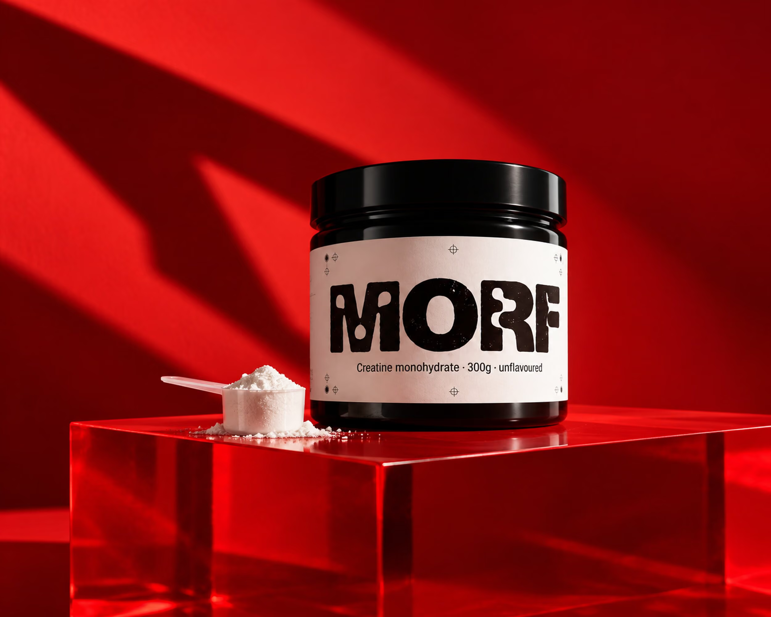
Supplement shelves shout. MORF wanted to be the calm, confident jar in the gym bag: one ingredient, one colour and one clear promise, built to look as strong as the people who use it.
The challenge
A crowded category full of neon labels and exaggerated claims, for a product that is simply pure creatine monohydrate. The brand needed to feel premium without pretending to be something it is not.
Our approach
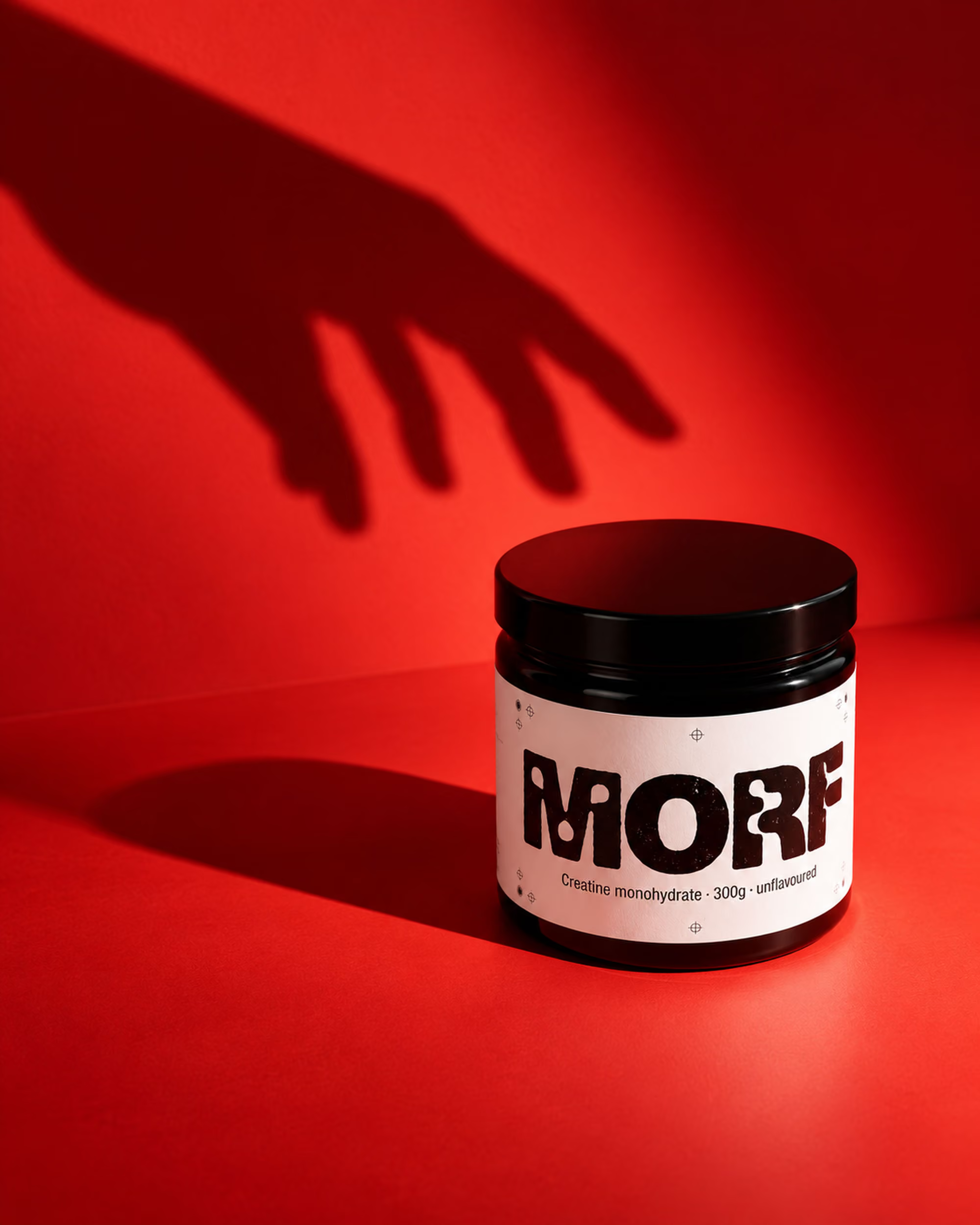
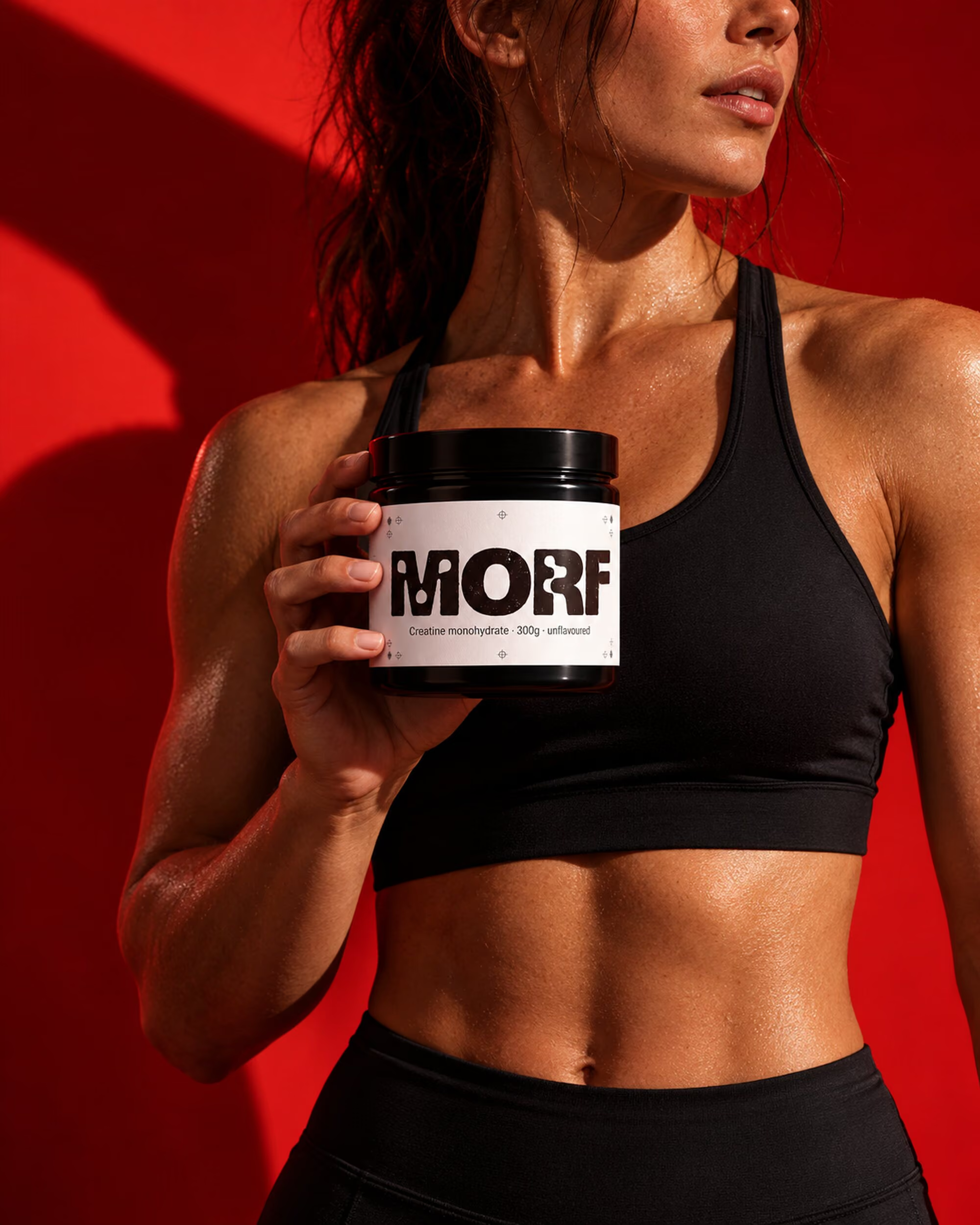
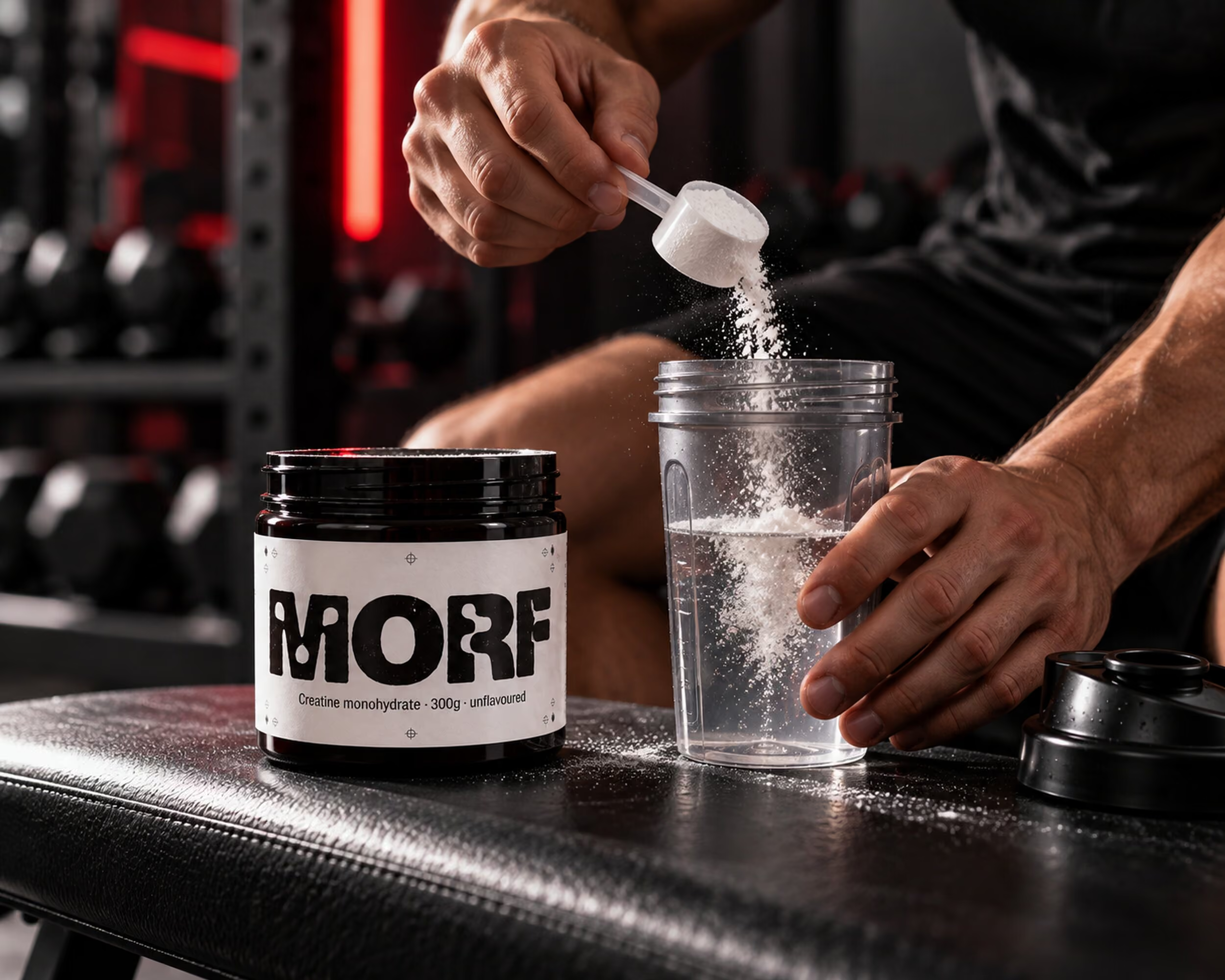
We named it MORF, short for morph, drew a heavy custom wordmark and set it on a black jar with a plain white label. A single signature red carries every campaign, from the studio hero shots to real athletes in the gym.
- Naming and custom wordmark
- Jar, label and scoop packaging
- Studio and athlete campaign photography
(Results)
After launch
+210%
Online sales in year one
4.8★
Average customer review
Best Identity
Brand New award
“People photograph the jar before they open it.”
— Lina Voss, Co-founder, MORF